EIS is more than a design agency; we are a catalyst for growth, a bridge to digital success, and a creative partner that goes above and beyond to deliver results.
Elegant Image Studios Web Design

OVER 3,000 WEBSITES CREATED
SINCE 2001.
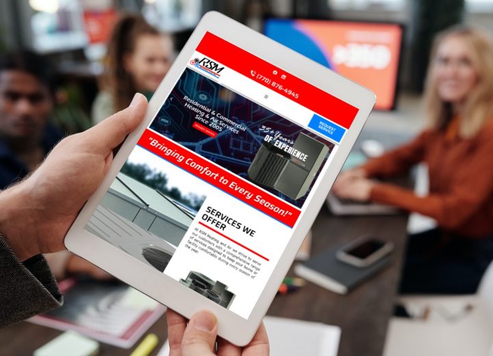
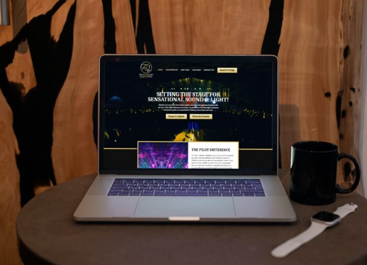
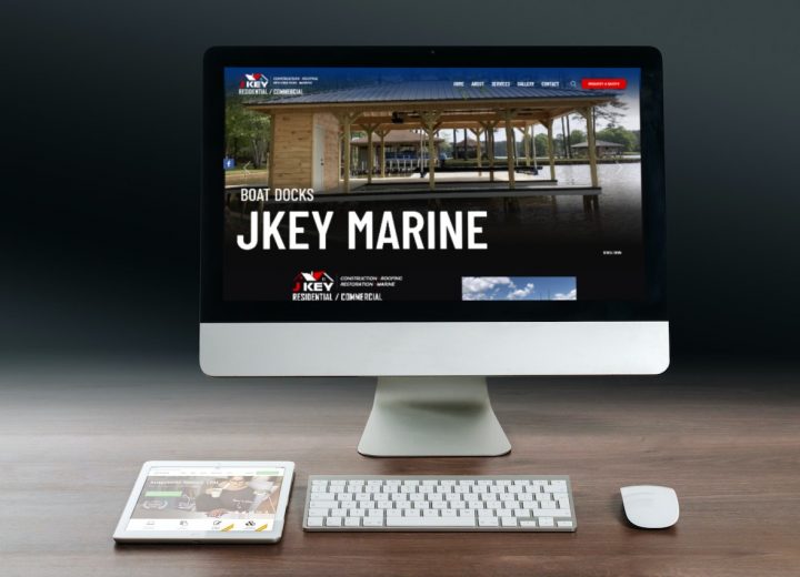
 Elegant Image Studios stands as a pinnacle of creativity and innovation in the realm of web design and digital aesthetics. With a steadfast commitment to transforming visions into digital realities, we craft websites that are not just functional, but true works of art. Every pixel is meticulously placed, every element thoughtfully designed, resulting in an online presence that seamlessly blends form and function. Our team of talented designers, developers, and creatives collaborate harmoniously to bring forth websites that capture the essence of brands and businesses, enhancing their online impact. From sleek and modern to intricately detailed, we possess an uncanny ability to mirror the ethos of our clients in captivating digital spaces. With an impressive portfolio and a reputation for excellence, we are the embodiment of the phrase “web design redefined.”
Let us show you how we can bring more customers, clients, or patients to your business, organization, or practice thereby increasing your sales and your bottom line.
We can accommodate any business no matter what size, designing and developing a professional web presence to fit your budget. Call us today at (678) 457-7939 for a free, no-obligation quote on taking your internet presence to the next level.

-
It was a great decision for us to work with Elegant Image Studios on our website set up. They did a fantastic job, and made the process very easy from start to finish. When I required extra guidance, Bob and Laura were happy to give their time and effort to make this happen. Thank you
Randy Hudson
April 18, 2024 -
Outstanding work and service! Bob, Laura and their team did a fantastic job with a new website for my business! Laura was able to blend some content from an older existing site and handcraft a new vision with video and text that was beyond my expectations! Great service and performance. I would highly recommend them! Patrick
Patrick O'Donnell
February 5, 2024 -
So impressed with the website Elegant Image created for me. They were always there to answer any questions I had and got the website done quicker than I expected. They are very knowledgeable and creative. Could not be more pleased with their customer service and my overall experience with them!
Jarris Alexander
September 26, 2023 -
Elegant Image has been our website design consultants for many years. The are a very professional team of designers and SEO consultants. We've been very pleased with their work and would recommend them to anyone needing web design or web presence consulting.
John Jordan
September 22, 2023 -
Bob is an exceptional web developer who went above and beyond to exceed our expectations on our recent project. He demonstrated an impressive depth of understanding of our project's goals, offered valuable insights, and maintained open communication throughout. Bob's dedication to delivering excellence was evident in his ability to consistently meet and surpass deadlines while ensuring every aspect of the website was polished and functional. His technical proficiency, attention to detail, and commitment to our satisfaction set him apart. We highly recommend Bob for any web development project; his expertise and work ethic make him a standout developer who can bring your vision to life. Thank you, Bob, for your outstanding work!
NXTGEN BODIES MD
September 22, 2023 -
Elegant Image Studios have been a blessing. Bob and Laura are great to work with. When we started the idea of having an e-commerce site created we were unsure of how it would all work out, however Bob and Laura not only designed and created our site but walked us through every aspect of it and we felt confident right away. They are professional and stand by their word. Thank you for my beautiful website. It's been a pleasure working with you.
Cary Navarro
June 24, 2023 -
Bob and Laura did an amazing job creating a logo for my company and building my website. They even take the time to teach you how to operate and change things once they complete the project. Highly recommend them.
Kim
June 13, 2023 -
Bob & Laura with Elegant Image Studios Web Design are awesome! They designed the 1st website for us and did such a great job that we hired them to design our 2nd website. Again, they exceeded our expectations. They were always on time, professional, and easy to work with. We highly recommend them for all your web design needs and more.
Hail Naw Roofing
June 7, 2023 -
We have been a client of EIS for 20 years. In fact, we are one of their very first clients! Bob and Laura are amazing. They are attentive and responsive to our needs and always looks out for us in regard to updates to our site and for improvements etc. EIS put their clients first and I couldn't recommend them any more than to say if you want the best, you'll have the best if you use EIS to develop your website and social media needs to grow your business!! PUGLISE LAW
Mike Puglise
May 25, 2023 -
I came to Bob with an entire mess on my hands (getting screwed over by Lost Highway Media), and he went above and beyond helping me get my new website up and making sure I was well-informed and up to date through every step of the process. I am looking forward to working with the EIS team further, as they have already been a huge help, incredibly accommodating, and shown impeccable communication skills. Bob is very approachable and friendly, and he will do his best to make sure you are happy with your product. They are dang good at their work, and compassionate with their clients. Side note, best prices around. While I was shopping around, Bob knew I was shopping prices, and maintained a good attitude with me while he was probably waiting on me to circle back around to him. Love Bob, love their work, love their location.
Abby Alewine
May 17, 2023
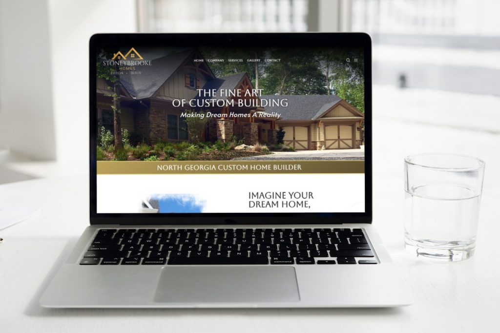
Making Dream Homes a Reality: A Closer Look at Stoneybrook Homes’ New Website Design
In the picturesque landscapes of Northeast Georgia, custom homes that blend seamlessly into the natural beauty of the region are a sight to ...
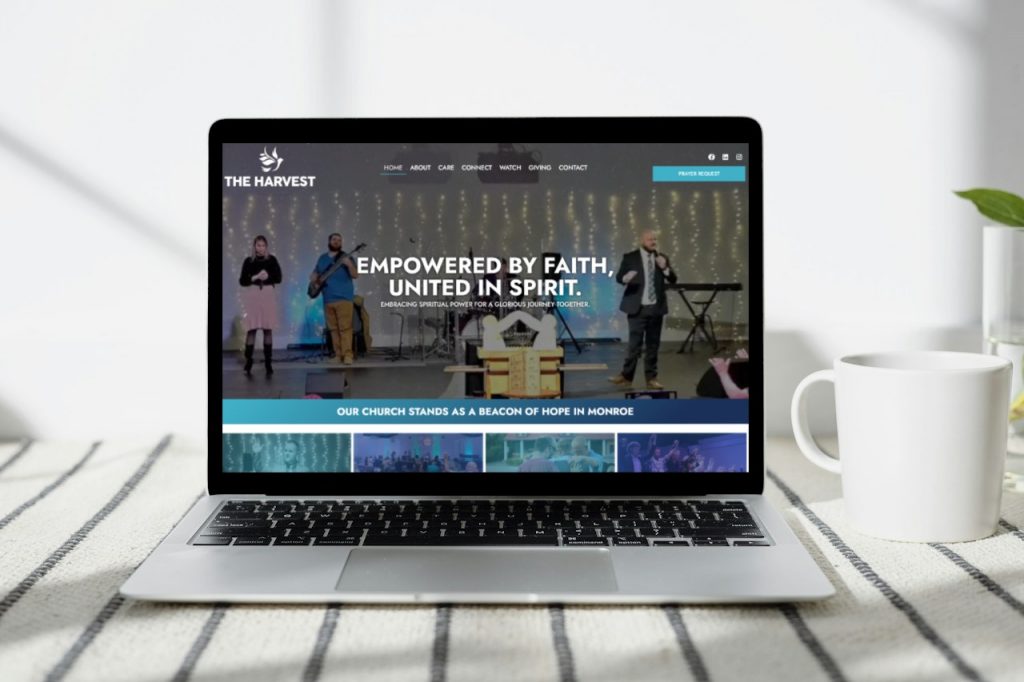
Welcoming Jesus Online: The Harvest Church’s New Website Design Concept
In the digital age, where our online presence often serves as the first point of contact, having a welcoming and engaging website is ...
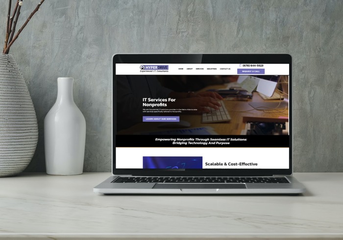
Revolutionizing Digital Support: Unveiling the Website Design for HyperDrive IT Services
In the ever-evolving landscape of technology, where innovation drives progress and connectivity bridges gaps, HyperDrive emerges as a beacon ...
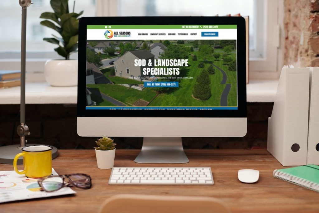
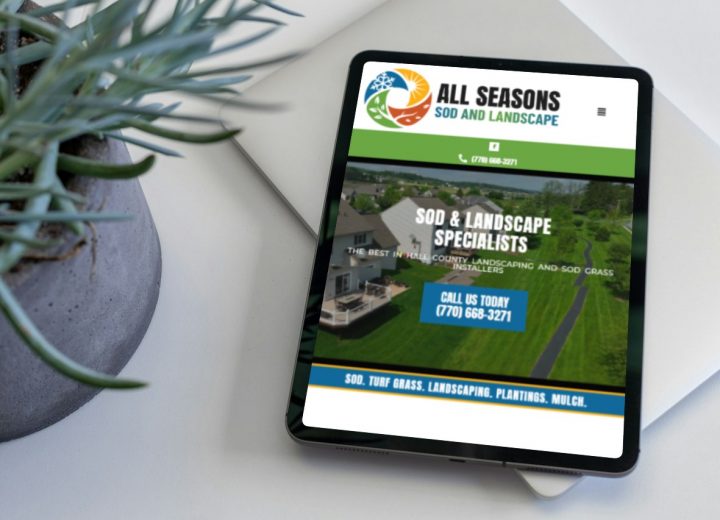
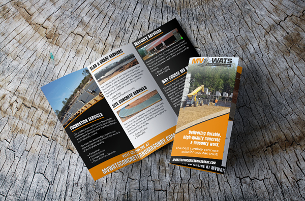
All Season Sod & Landscape Website Design Concept
Elevating Green Spaces in Hall County, Georgia! We are delighted to present the website design for All Season Sod & Landscape, ...
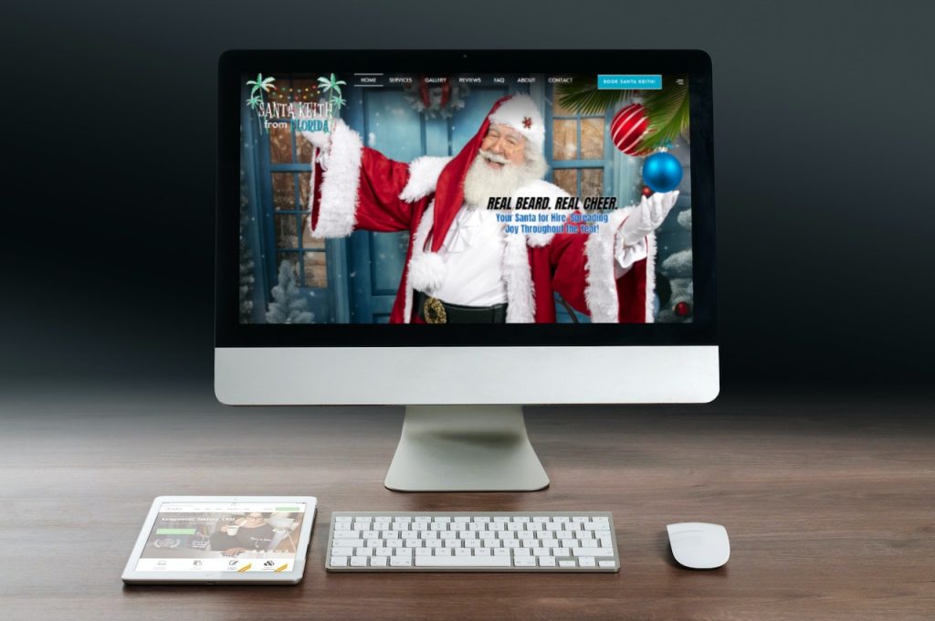
Bringing Joy Online: Unveiling the Website Design Concept for Santa Keith from Florida
klklkIn the sunny state of Florida, where palm trees sway and sunshine reigns, there exists a magical figure who spreads joy and cheer all ...
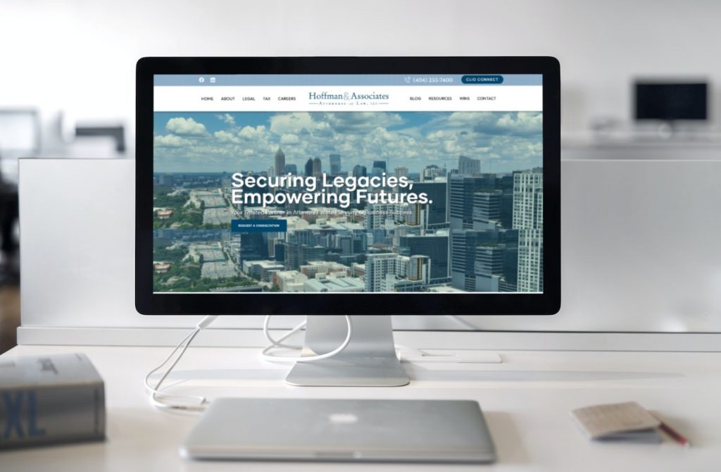
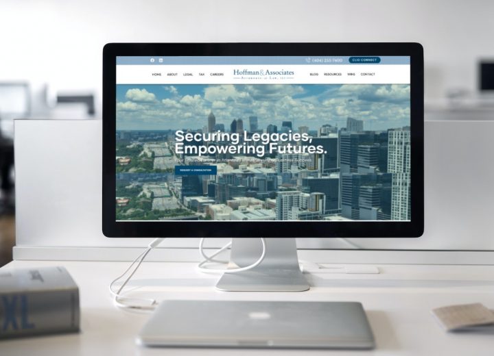
Unveiling the Website Design Concept for Hoffman & Associates, LLC: Elevating Legal Excellence Online
In the dynamic landscape of legal services, where precision, expertise, and trust are paramount, Hoffman & Associates, LLC stands as a ...
