Atlanta Tattoo Removal Website Design Concept
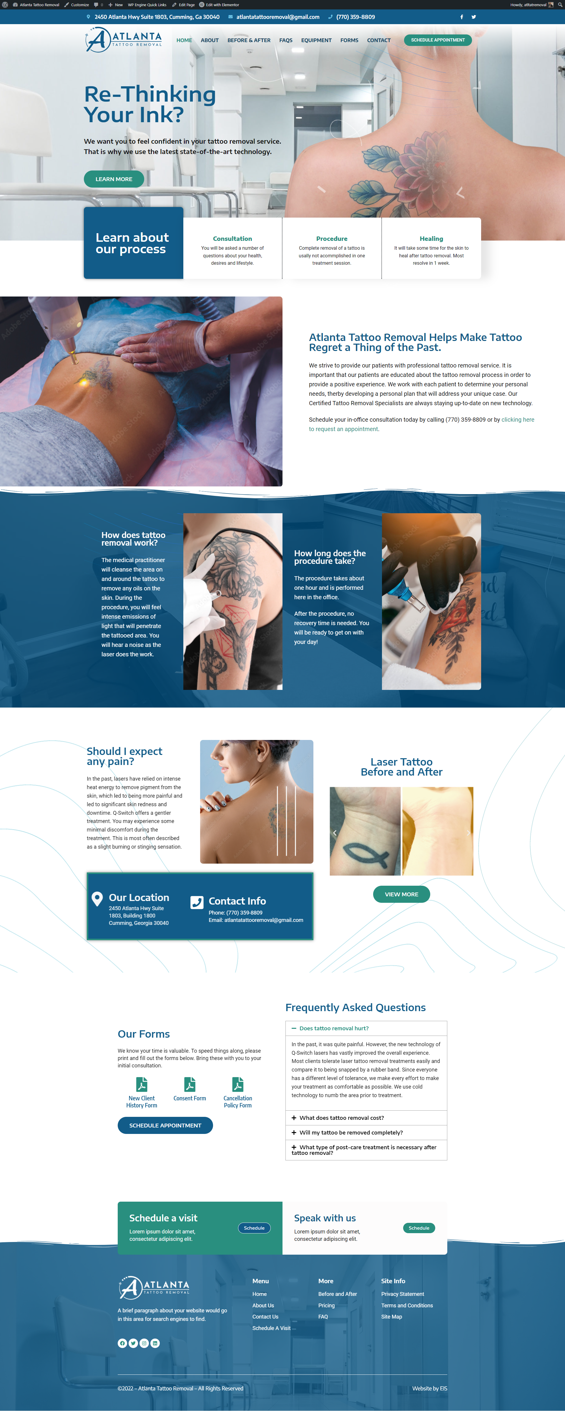
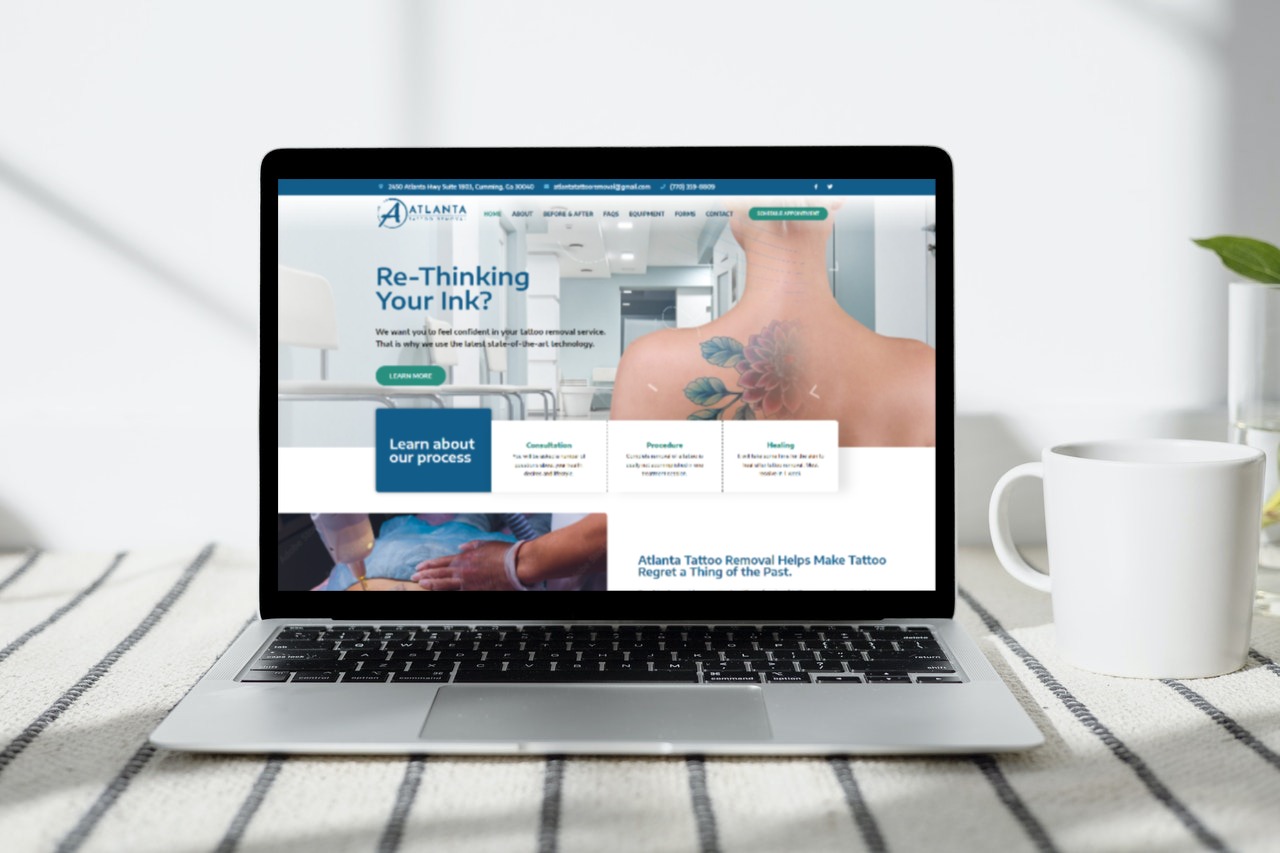
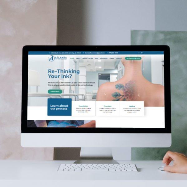
This is one of our latest new website design concepts for our new client, Atlanta Tattoo Removal.
The client stated they wanted: Easy to navigate, legible tabs, photos that are sized and arranged similarly (before and after). Even though we have recently redesigned their logo, they wanted the same blue tone color, so we had to play around with that color and Laura thought of adding the teal blue color since it seemed to glow nicely with the blue tone of their redesigned logo.
The client provided us feedback: “Laura & Bob, Thank you for the update of the website. We had no idea that you were already moving forward to this point, which is a pleasant surprise! There is a lot to like, including colors, the layout in the different formats, and information”.
Look for their new website, coming soon…
