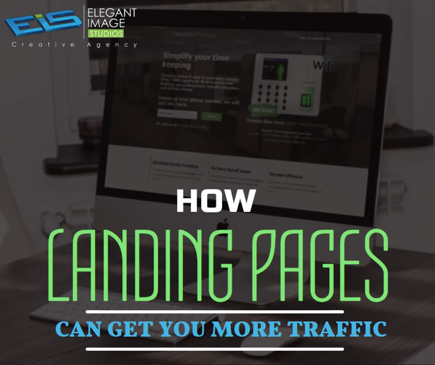
As you dive into the world of digital marketing, you’ll likely encounter a whole new vocabulary and set of concepts. If you haven’t already, you’re bound to have questions about how landing pages fit into your digital marketing strategy. Developing a landing page sounds like a simple task, and it can be, but it’s vitally important to lead conversion.
Website design is a versatile and ever-changing field. Website designers must keep up with industry news, brush up on their skills, and evolve their style to execute the latest design trends.
SEO mistakes can be devastating to a website’s placement in the SERPs (Search Engine Results Pages). Whether you have a new website or you have had your site up for a long time, this article is for you.
Not keeping track of your website’s metrics, or doing it but not taking action based on what you find, is more or less equal to walking around in pitch darkness hoping to somehow reach your destination: both are possible but highly unlikely.
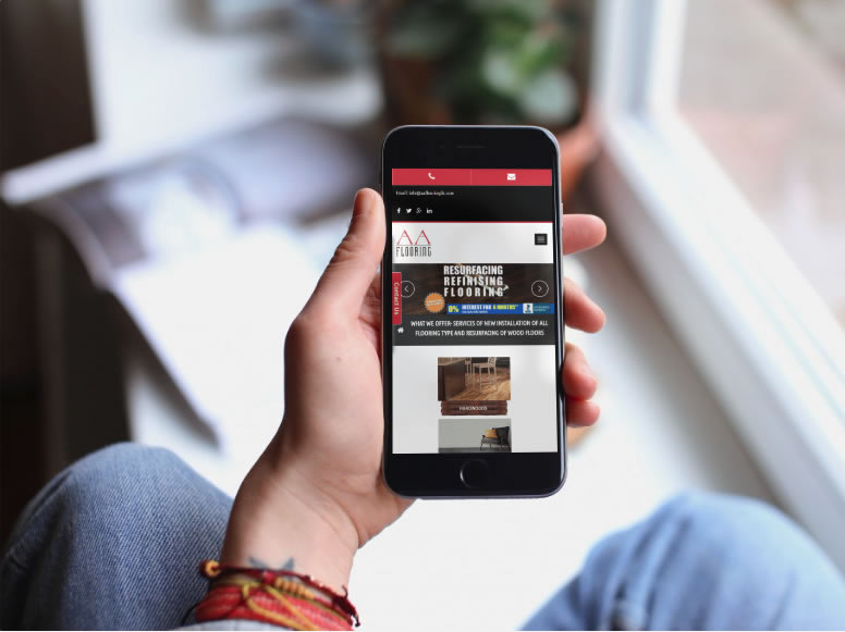
01. Keep your homepage minimalistic and free of clutter We rarely read every word on a website. Instead, we quickly scan pages, picking out keywords and sentences. With these known behaviors in mind, it’s better to appeal to emotions rather than word count. The less someone looking at your site has to read, click on or remember, the better they’ll be able to process and evaluate what’s going on in front of them. That makes it more likely for them to do what you wanted them to do in the first place. Text and Calls To Action are necessary, of course, but make sure to break them up into larger subheadings and legible paragraphs. We also suggest using images or icons as alternative ways to communicate your point. 02. Design with the visual hierarchy in mind We’ve come a long way from stone tablets. With computer screens and smartphones, as the technology to display information evolves, it remains the designer’s job to arrange the content in a clear manner. You only have a few seconds to grab someone’s attention and tell them what your site is about. If you establish a clear hierarchy of your information, readers can’t help but unconsciously follow the breadcrumbs you have left for them. Then apply color, contrast, size, and spacing for further accentuation, remaining conscious of what is drawing attention to your page and making sure that it’s always intentional. One of the best design elements we have found for creating a strong visual hierarchy are strips: These will help organize your website into clear, digestible pieces of content. 03. Create easy to read website content “Readability” measures how easy it is for people to recognize words, sentences, and phrases. When your site’s readability is high, users will be able to efficiently scan your site and take in the information in the text without much effort. Achieving website readability is relatively easy; try these key rules: Contrast is key It’s very important to have sufficient contrast between your text and its background so that the text is clear. You most likely have carefully selected colors that are part of your brand identity and they should be represented on your website. Feel free to play with colors, just don’t sacrifice readability for creativity. You can’t read what you can’t see Early websites had small fonts, but, over time, people realized that 12pt fonts are hard to read online. When a screen is 24 inches from someone’s face, most people will struggle to see smaller fonts. A typical rule of thumb you’ll see on the web is to keep your body text at least 16pt. That’s a good place to start, but keep in mind that this number completely depends on which font you’re using. Serif vs. Sans Serif You might not choose your family, but you do choose the type of font family you use. Serifs are those little projecting points or lines that some fonts have on the ends of their letters – Times New Roman, for instance, is from the Serif fonts family. Sans Serif literally means “without serif”. These fonts are typically the best choice for online texts – like the one you’re currently reading. Side note: We know that script fonts (The ones that look like handwriting) are really cool with all the fancy curves and stuff, but please consider your visitors’ eyes – give them a break! There is such a thing as too many fonts As a rule, don’t use more than three different typefaces throughout a single website. Some projects may call for more elaborate font combinations, but if you do choose to use a variety of fonts, the overall effect should be harmonious, not cluttered. 04. Ensure your site is easy to navigate It may be of your design nature to break the mold, but website navigation is not the place to be avant-garde. Don’t send visitors on a wild goose hunt when wandering through your site. A site with a solid navigation helps search engines index your content while improving the viewers’ experience: Link your logo to your homepage: It’s a common practice that your visitors are used to and will save them some precious clicks. If you don’t have one, we offer logo design as a service. Mind your menu: It should be on the top (in the header) of your website and structured according to the importance of each section. Offer some vertical navigation: If your site is of the long-scrolling variety, try to use an anchor menu. With one click, viewers will be able to quickly go back to the top, down to the bottom or directly to any section of the site. Work on your footer: Your footer is probably the last thing to be seen on your site, so remember to include all the important links there. This may include a shortened version of your menu, social icons and additional important links (terms of use/FAQ/contact/blog etc.) your visitors may need. Keep your important content “Above-The-Fold”: This is less of a “navigation” tip per say, but it is still important to that matter. Remember that your visitors should understand what your website is about without having to scroll. 05. Stay mobile friendly We live in a mobile society, which makes it important to ask the question: What do my visitors see when they access my website on the go? Never fear! We automatically create a mobile-friendly version of your site for you so that you can keep pace with the increasingly mobile world. Be sure to put yourself in the position of the user, and test out every page, user action, and button. Article from https://www.wix.com/blog/2017/10/5-design-tips-for-a-professional-site/
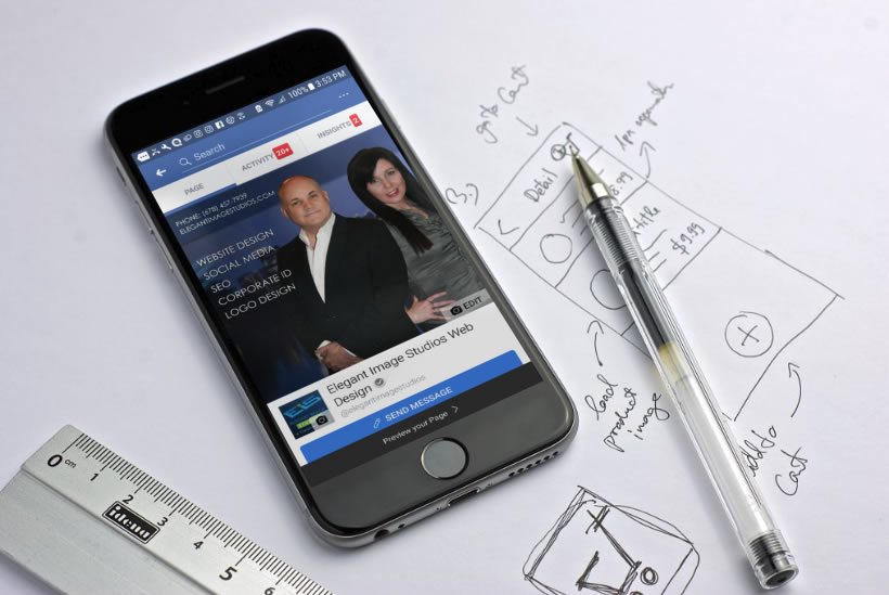
We are always here to help at Elegant Image Studios. We are going to share the top 5 web design tips for you to look for no matter what developer you hire for your next project. Site Is Not Mobile Ready: Responsive websites are a must! Every year, more and more web browsing is done on phones and other devices. Mobile is the now and it’s definitely not going anywhere. If your website cannot adapt to different screen sizes then your site is not mobile friendly. This tiny mistake could lead to losing out on multiple sales and conversions. So how do you fix the problem? You need a responsive website. Stale and Bland Content: If you want to generate long-lasting leads, you must have good content. Good copy will help you gain more site traffic and make people trust your company or service. Google recommends a 300-word minimum. Also, keep in mind, your content should always offer value to the customer in terms of tips and ideas. Original Photography is Important: This website mistake is probably the most common. Customers like to see visually appealing images when they visit a site. Taking the time to find high-quality images is easy and will definitely be beneficial in the long run. Poor Navigation: Without proper site navigation, your customers can become confused and overwhelmed. It’s important to limit the links in your menu and then put them in order that would make sense for your customers when they visit your site. Their needs to be a coherent direction or sequence of steps for the customer to take. The goal is for them to learn more about you and your services first. Bad Text: If your customer can’t read your content, then there’s a good chance there will be no sale. There are three main things that can affect the readability: font, color, and most importantly, size. It’s best to choose a font that is approximately 16 px. Another major point to keep in mind is that the size of your text will depend on the font style as well. When it comes to font colors, stick to a dark color if your background is light and vice versa. You want to make sure that your color palette is cohesive. We hope this will give you a better insight into making your website work better for you and your business. Whether you need to remedy your mobile ranking or want to jump ahead in the marketplace, we’ve got the answers you need, with innovative web design based on extensive market research. Please contact us at Elegant Image Studios (678) 457-7939 today and let us help your business grow!
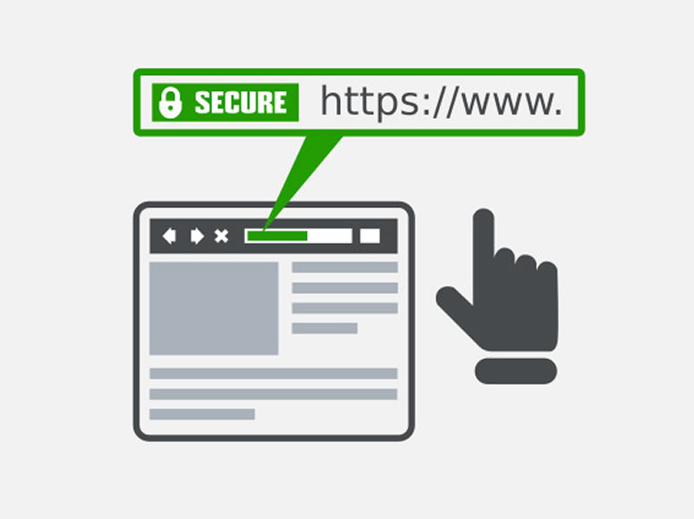
We strive to keep our clients informed of the latest developments in the online community. We want them to feel confident that we will share our expertise and help their business succeed. There has been a lot of buzz recently about SSL Certificates. What are these, why we recommended them, and why might you consider owning one now for your business? The SSL Certificate SSL stands for Secure Socket Layer. It is a security protocol that conveys your communications over the Internet in an encrypted form. SSL encoding is commonly employed by eCommerce websites (but continue reading even if you do not have an eCommerce site because you too can benefit from having an SSL Certificate) to protect sensitive information such as credit card numbers or personal data. SSL certificates ensure that information is delivered to the server for which it was intended, without falling into the hands of third parties (hackers!) who could tamper with the data. You’ll recognize sites that have an SSL certificate by the domain URL https://, rather than the unsecured http://, plus the green padlock icon that appears in your browser’s address bar (the color/appearance varies by browser). What Are the Benefits? Trust & Reputation — An SSL certificate helps build a trusted online brand recognized by customers as a reputable website. When completing transactions over the Internet, online shoppers trust the https:// URL and padlock symbol over the unsecured http:// URL. With an SSL certificate, you can inspire the highest level of trust in your customers. That means you can confidently sell products or services in an online shop knowing that each of your transactions is secure. Search Engine Ranking — In addition to popularity with customers, an SSL certificate will make you popular with search engines as well! The SSL certificate is recognized by Google’s algorithm as a seal-of-quality and assurance, meaning your website will appear higher up in the search engine’s results compared to unsecured websites. This means that you will enjoy increased traffic to your website from customers searching for your services on Google – all you need to do is show them that the security of their sensitive data is your priority Here are a few features of the superior SSL Certificates we use: 256-Bit SSL Encryption — World-class 256-bit SSL encryption for maximum protection Over 99% Browser Recognition — All major browsers recognize these security standards Lightning-Fast Validation — The digital verification (validation) is accomplished easily online, with no tedious paperwork or forms Are you interested in obtaining an SSL certificate? Call Us Today at (678) 457-7939 or Send us a message, and we can set this up for you!
We’ve spent a ridiculous amount of time in recent weeks figuring out the ideal dimensions for Facebook Group, Page and Cover cover photos. And even if you have the correct dimensions down, you now have to make sure the key to crop mark is in place. “Why don’t you just Google it?” We hear you say. Wel, Googling it results in a mass of conflicting recommendations – mainly out-of-date. Ideal photo sizes have changed over the years (of course – this is Facebook after all). And what we have realized is most of these recommendations are far from optimal going into 2018. FB cover photo sizes: wake up to an era of mobile and video-first version: you now need to be creating all cover photos (Page, Group, and Profile) at 1920px x 1080px. And yes, we are fully aware that 1920px x 1080px is WAY deeper than the traditional letterbox size. We social media managers spend far too much time on a desktop rather than using Facebook like our fans and Group members do – i.e. on their mobiles/smartphones. Cover images on mobile in our recommended dimensions render in full. If you’ve only uploaded the traditional letterbox size you’ll be missing out on a bunch of smartphone real estate. That same photo will be cropped (probably badly) on tablet and desktop. Our recommended 1920px x 1080px size is actually a 16:9 aspect ratio. If you’ve spent any time working with video, you’ll know that this is the standard size for HD video. And of course you can now upload video as an alternative to a photo on your Facebook Page (that option for Profiles and Groups is bound to be here sometime soon – slideshows on Pages is also currently in an early roll-out). So there we have it – Facebook is thinking mobile and video-first. The OLD shallow letterbox size (which you’ll still see recommended by a lot of people) is: Groups: 820 x 250 (we recommend you create this in 1920 x 1080) Pages: 820 x 312 (we recommend you create this in 1920 x 1080) Personal Profile: 851 x 315 (we recommend you create this in 1920 x 1080) But for the reasons we explain below, it’s a lot better to create your photo in deeper 16:9 dimensions: Universal recommended size for all all Facebook cover photos (Page, Group and Profile): 1920px x 1080px What about the resolution? As well as this dimension change we’ve gone for a high-resolution recommendation because we are also considering the rise of higher res devices such as Retina Display – you want your cover photos to look all crisp and clear there too don’t you! 1920px x 1080px future proofs you to some extent and also covers off pretty much any other device currently on the market. On resolution, Facebook doesn’t help when it says “Keep in mind that your cover photo must be at least 400 pixels wide and 150 pixels tall”. This is simply a minimum size and in our experience, we find it way too grainy and the advice gives no guidance on safe areas for text. So long as it’s not a crazy size you won’t be penalized for uploading a nice large high res photo (this used to be the case with Facebook Groups where compression was applied) but no more. One word of warning, depending on the screen you use to view (i.e. non high res/retina display), you may find the image a little fuzzy. We’ve experimented with JPG vs PNG and a variety of sizes from 640×360 all the way to 1640×923. Now 820×461 often looks the sharpest on older displays but we’d still recommend 1920px x 1080px for best future proofing. What are the downsides of this deeper Facebook cover photo? The upside is a lovely deep photo to play with that renders in all its depth on mobile. However, on a desktop it gets cut a little as our cropping graphic below shows. These deep dimensions give the best view on mobile as it uses the entire photo and gives you the largest area possible for the photo on the native app. It also gives you a larger area for any text that Facebook itself places on top of the photo in some scenarios. As you don’t have an option to upload different variants for mobile vs desktop rendering you need to be super-aware of where your photo will get cropped on different devices. Keep text to the safe area and ensure that nothing else in the picture looks weird when savagely cropped. How does Facebook crop cover photos? Key to crop marks The image will render at full size on most mobile/smartphone devices Tablet Crop – this is where the photo will be cropped on a tablet and on mobile browsers (not the app) Desktop Crop – the photo will crop like this on tablets when using a browser (not the app) and on PC or Mac desktop Group Circular Icon – a circular photo that surfaces in some settings (for instance on the Page as the linked Group, in recommended Groups on the mobile app, likely to be in the upcoming Group Stories feature, suggested Groups). Where that crop goes does depend on faces in the photo – Facebook tends to pull them into the center of the crop so if you have a face in the right or left it’s likely there because a face has been detected. Other times Facebook seems to crop in the middle of the “busiest” part of the image When you upload the photo you’ll be able to move it up and down which will give you a little more control on the desktop crop position (download our free Facebook Cover Image Guide for more information about how that works). If this is a bit too much information and you are feeling frustrated then give us a call today and let us take a look at your current cover photo for your business page or
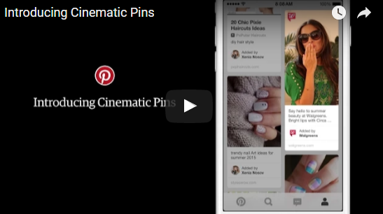
New mobile ad product enables brands to tell stories with looping video ads with the motion controlled by users’ scrolling. Pinterest believes it has found a better way for advertisers to capture consumer attention with motion. Called Cinematic Pins, announced today and coming to Pinterest streams this summer, the new mobile ad product enables brands to create moving Pinterest advertisements. And because the motion is controlled by Pinterest users, the company says, the experience won’t be annoying … like, for instance, autoplay video ads. “What’s really unique about this is that it keeps the user in control,” Tim Kendall, Pinterest’s general manager for monetization told Marketing Land. “We believe that autoplay as it exists today is interruptive and annoying. What we believe we have achieved with Cinematic Pins is a way to delight the user, let them stay in control of motion while also allowing the brand to tell their story.” For Cinematic Pins, users will maintain that control via scrolling on mobile devices. (The ads won’t be served to desktop users, which makes sense since more than 80% of Pinterest activity takes place on mobile). The ads will display on home and category feeds; when a Cinematic Pin comes into view, it will start moving. It will move at the speed the user is scrolling and stop when the user stops. If a user clicks into the Pin, he or she will view a longer, looping version of the video, which plays without sound. Article from: http://marketingland.com/pinterest-will-set-ads-in-motion-with-cinematic-pins-129130
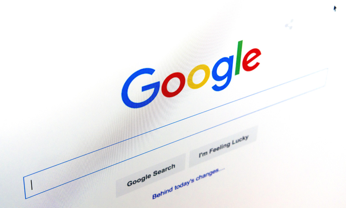
Google recently changed the layout of its search engine results pages (SERPs) by removing ads from the right side and adding extra ads at the top and bottom. In a nutshell, Google has increased the number of paid ads showing at the top of certain types of SERPs from three to four. Also, SERPs now feature three ads at the bottom. In total, the number of paid ads on SERPs has been reduced from 11 to 7 ads. Also, the right sidebar no longer features any text ads. Search engine results pages have fewer ads now and those ads appear in different places. According to most search engine experts, Google’s new update was long overdue especially in regards to right-side ads. Numerous studies have indicated that searchers rarely click on right-side ads. There is also evidence indicating that Google has been continuously gravitating toward becoming a more mobile-friendly search engine. Given the fact that the right-side column of ads wasn’t visible via mobile search, the ads had to go. EFFECTS OF GOOGLE’S NEWEST UPDATE ON SERPS With the recent developments, there has been a lot of speculation on how these new SERP ads update will affect SEO and PPC for instance, how do the new changes impact organic ranking? Should website owners change their SEO tactics or is it business as usual? These are some of the questions that have been lingering in the minds of many website owners. Although there appears to be a rushed general consensus that these changes will impact SEO negatively, this is far from the truth. On the contrary, Google’s newest update on SERPs has made good SEO more important which is a good thing for business owners with great SEO strategies. For instance, there is more focus on organic search results with the right-side ads out of the way. Furthermore, the update only affects SERPs with highly commercial queries. A number of keyword types have remained ad-free or feature just one or two ads on top. These keyword types include; e-commerce keywords featuring PLAs (Product Listing Ads) and no-text ads as well as long-tail keyword phrases. Also, SERPs still feature 10 blue links. The addition of paid ads on the body of search engine results pages hasn’t squeezed off organic ranking positions to other pages. Although organic results have been pushed down slightly on SERPs, the total number of results on all SERPs has remained consistent. Although SERP elements such as answer boxes, related questions, blended image search results etc., can make SERPs include fewer results than the standard ten results, the new update hasn’t lowered the number of organic result count. Navigational branded searches have also remained constant. With that said, it is important to recognize the fact that most website owners looking to improve their organic search traffic may not be amused with the addition of ads before organic links. It is, however, important to note that the average searcher scrolls down SERPs. There is, therefore, no reason to think that the new SERP structure will modify searchers behavior negatively (e.g., searchers won’t scroll down as usual because of the ads). Nevertheless, it is important to react to this update with a solid SEO strategy since the new SERP layout is here to stay. With the right-side ads out of the way, the click-through-rate for first-page organic page results is bound to increase as searchers focus their attention on one column. Website owners must, however, modify their SEO efforts to ensure they grab the attention of keen searchers faster and better than their competitors. An increased focus on click-earning page titles and meta descriptions is certainly something you should be considering to capture more clicks from your valuable first-page real estate. Strategic keyword research is also more important now, more than ever. Website owners must do thorough research on their keywords to identify the SERP layout they will be competing within for different keywords. Website owners need to find and place priority on keywords and keyword phrases that attract fewer ads at the top of SERPs and between organic results. This does not mean you shouldn’t have topical pages it simply means you need to understand what you are competing against for your primary terms. Website owners also need to review top keywords (especially ”highly commercial keywords”) to see the effects of the new SERP layout on their ranking position and craft strategies for improving where necessary. This applies mostly to search results targeting images, videos, and featured snippets. There is also a need for a full review on local search strategies not to mention the importance of placing more emphasis on mobile search going forward. Website owners also need to think about balancing their paid search budgets strategically since PPC ad costs may go up as paid ads get some more attention and the answer isn’t always to spend more when you can’t boost performance organically.
