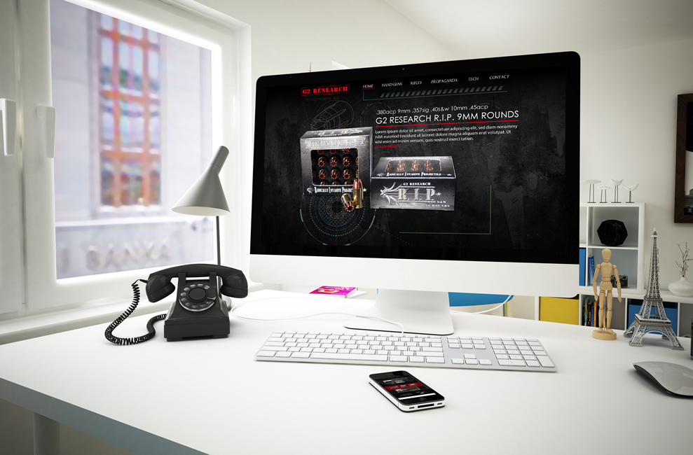
G2 Research Website Design Now Availble
G2 Research is based out of Winder, Georgia. They are a Bullet Manufacturer. Class 6 Licensed FFL, Specialty Ammunition. G2R’s relentless study and applied physics have derived a radically invasive projectile that outperforms the rest.
Here are some specifics about this design. Of course nothing ever looks the best until the site is actually built and live on the net but I think this particular design concept would display nicely for the company. Tell us what you think by commenting below.
G2 Research reached out to us for a website redesign. Their current site is responsive but not built on a wordpress platform but on a Joomla platform you can view their current site here http://g2rammo.com/ (note: EIS was not responsible for their current site design).
1)The main large picture up underneath the main navigation buttons would be a slider area with different photos sliding in and out clickable if needed to point site visitors to other pages of the site.
2) In the red area I made a Videos button, company News Button (would point to the blog), and FAQs button.
3) Underneath those three buttons it may look weird right now with the ice block but would look really cool when built because it would be a video looping of whatever you would like to see. (like the bullet shooting through the ice in slow mo)
4) The next area in the black area would be a small paragraph about your company or products.
5) The next section in the white background shows Latest Products and I understand you won’t be selling on the main site but only to site visitors that are logged in to make purchases but wasn’t sure if you wanted to at least talk about and show photos of each so I wanted to include just a standard info area here which when clicked would take the site visitor to more information.
6) Underneath that section would be another information area to stand out from the other sections.
7) The next section would be a made in the USA banner.
8) Under that would be a main video showing with a recent news section pulling from the blog.
9) The next section would be the footer with the site map and contact information, copyright, etc.
10) It is not shown but I would install a floating Social Media set to automatically scroll down with the page.

If you are in need of a website redesign or know someone who is then please contact us today at (678) 457-7939 or visit our online portfolio here https://eis2022.wpenginepowered.com/?page_id=217 and dont’ forget we don’t just know website design but we also know marketing for your business. We know social media ins and outs. We know branding. And we know how important it is to maintain a website so if you find yourself too busy to maintain your own site then make sure you contact us for pricing on website maintenance packages that we offer.


