Horizon Roofing Website Design Concept
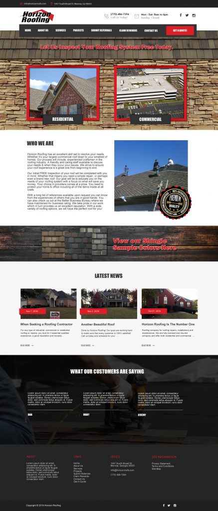
We wanted to show a design concept that would give the client a more professional look & personable touch. We realize that no website can replace the comfort factor that one can get when meeting with the company in person, but we find ways to infuse a website with certain design elements to draw a person in and make them want to hang around long enough to pick up their phone and give them a call and I want to also focus on making their website stand out from their competitors.
Just a little info on this concept:
- The two images “Residential” and “Commercial” against the stacked stone could actually be a slider area. So, there could be the two images come in and then scroll through your services to grab site visitors attention as soon as they land on the website.
- We made a section called “View our shingle sample colors here” and it could link to a page with their shingle colors.
- Latest News would be the blog portion of the site. We would link that up to their Facebook page so that when you make a new blog/news post it will automatically post to Facebook.
- I went ahead and wanted to show a Testimonials section but that could always be deleted if the client wishes to not use that section. But that could be set up to scroll through several.
- Visual Composer Page Builder – Easy backend editor which is a drag and drop page builder. This will help the client easily maintain your website.
- Sticky Header – for quick navigation
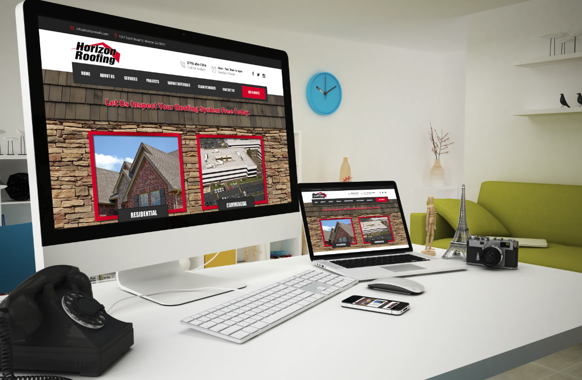
- Responsive & Retina Ready – The site will look amazing on any display.
- SEO Friendly – High-speed performance. Set up with clean and optimized code.


