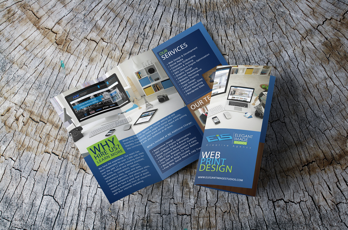
We have a NEW brochure
I seem to always put our own print materials and website on the back burner but we really needed a new brochure so this is the layout I came up with. CLICK HERE TO VIEW I wanted to share it with everyone to show that a business does not need a lot of copy on a brochure. Just basic information will do the job. Rarely will one will sit and read a lot of text on a website or print materials so I like to keep our verbiage simple. Most important things to consider is to make sure your company information can be found easily and make your brochure stand out. Make it interesting. And for goodness sake please make sure the colors blend well with one another.
– Laura Wright


