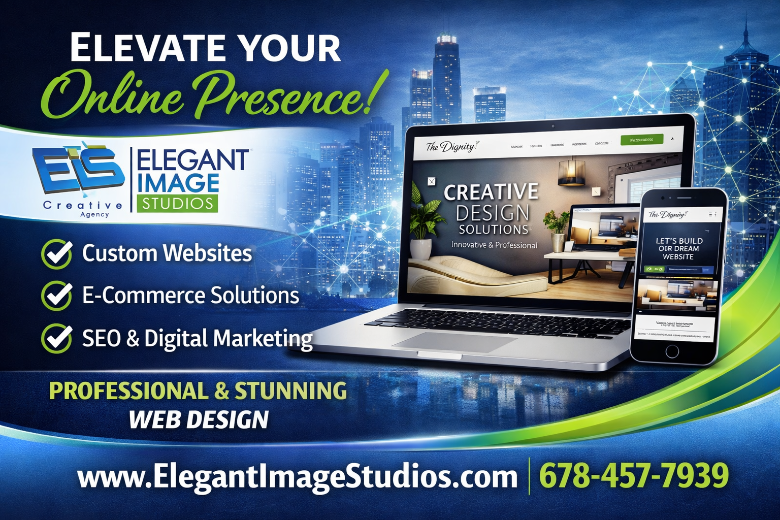
🚨 BUSINESS OWNERS: If someone searches for your service on Google right now… do they find YOU or your competitors? Most websites look good — but don’t bring consistent leads. At Elegant Image Studios, we install a 24/7 online sales machine for your business: ✅ Higher Google Rankings ✅ Google Maps Visibility ✅ More Calls & Lead Forms ✅ AI Blog Posting for Traffic ✅ Full Lead Tracking If ONE new customer is worth $1,000+, this system can pay for itself fast. Stop guessing with marketing. Start predictable growth. 👉 www.eis2022.wpenginepowered.com 📞 678-457-7939 Perfect for: Contractors • Law Firms • Med Spas • Dentists • Home Services • Local Businesses Are you showing up first — or helping your competitors?

In today’s digital landscape, a company’s online presence is just as crucial as the quality of its products and services. For businesses like Liberty Turf, which pride themselves on cultivating perfect lawns and delivering top-tier sod solutions, their website needs to reflect that same level of precision, professionalism, and aesthetic appeal. We are thrilled to pull back the curtain and showcase the website design concept we recently completed for Liberty Turf. Our mission was clear: to create an online experience that not only informed visitors but also captivated them, echoing the lush, vibrant beauty of a perfectly laid lawn. A Foundation Built for Growth Just as Liberty Turf prepares the ground for optimal growth, our design process began with a strong foundation. We focused on several key pillars: Visually Engaging Aesthetics: Turf and sod are inherently visual products. We leveraged high-quality imagery and a clean, fresh color palette that evokes the natural beauty of healthy green spaces. The design is modern and inviting, making a strong first impression. Intuitive User Experience (UX): A beautiful website is only effective if it’s easy to navigate. We prioritized a logical structure and clear calls to action, ensuring that homeowners, landscapers, and contractors can quickly find information on different sod types, services, and installation guides. From mobile to desktop, the experience is seamless. Showcasing Expertise and Trust: Liberty Turf isn’t just selling sod; they’re offering expertise. The new design prominently features their knowledge, testimonials, and commitment to quality, building immediate trust with potential clients. Educational content about turf care and selection is integrated naturally. Optimized for Performance: In the fast-paced digital world, speed matters. Our design considered performance from the ground up, ensuring fast loading times and responsiveness across all devices, crucial for both user satisfaction and search engine ranking. Ready to transform your own digital landscape? Contact us today to discuss how a strategic website design can help your business flourish.
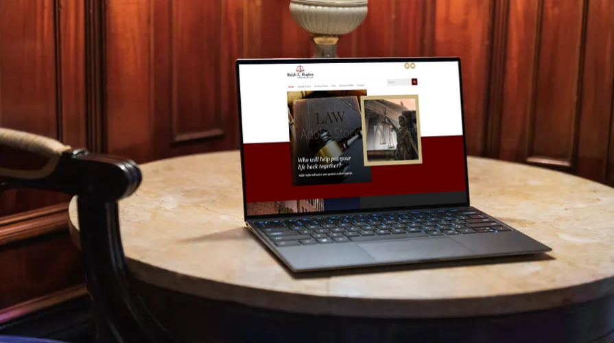
Ralph Hughes will answer your questions in plain language. You will understand your options through every step of the litigation process. His advice will be based on more than 30 years of experience in the resolution of catastrophic injury and wrongful death cases.
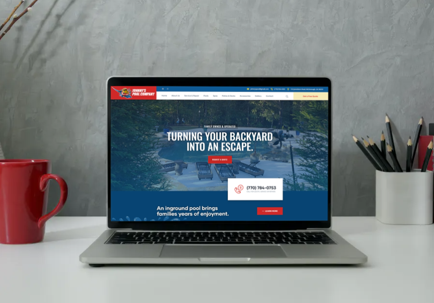
Johnny’s Pool Company is a family-owned and operated pool and spa company. Their background consists of many diverse residential backyard projects. They specialize in helping clients design a sanctuary for the outside of their homes. Many homeowners are looking to their homes for an escape from their hectic lifestyles.
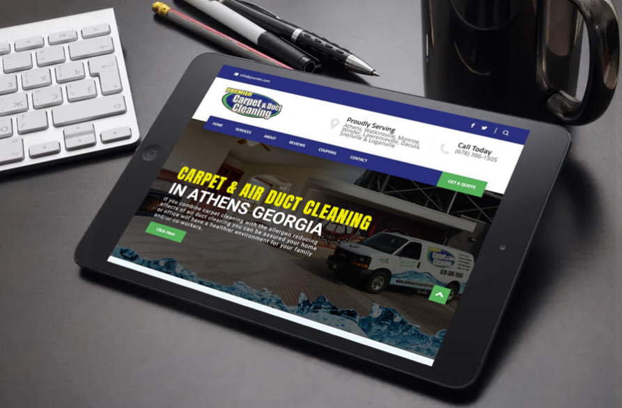
Premier Carpet & Duct Cleaning serves the entire Athens Georgia area with all your carpet cleaning, upholstery cleaning, and duct cleaning needs. When you call them you can be assured that your carpet will be cleaned and treated by a licensed, trained professional. If you combine carpet cleaning with the allergen reducing effects of air duct cleaning you can be assured your home or office will have a healthier environment for your family and/or co-workers.
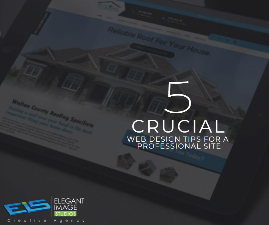
01. Keep your homepage minimalistic and free of clutter We rarely read every word on a website. Instead, we quickly scan pages, picking out keywords and sentences. With these known behaviors in mind, it’s better to appeal to emotions rather than word count. The less someone looking at your site has to read, click on or remember, the better they’ll be able to process and evaluate what’s going on in front of them. That makes it more likely for them to do what you wanted them to do in the first place. Text and Calls To Action are necessary, of course, but make sure to break them up into larger subheadings and legible paragraphs. We also suggest using images or icons as alternative ways to communicate your point. 02. Design with the visual hierarchy in mind We’ve come a long way from stone tablets. With computer screens and smartphones, as the technology to display information evolves, it remains the designer’s job to arrange the content in a clear manner. You only have a few seconds to grab someone’s attention and tell them what your site is about. If you establish a clear hierarchy of your information, readers can’t help but unconsciously follow the breadcrumbs you have left for them. Then apply color, contrast, size, and spacing for further accentuation, remaining conscious of what is drawing attention to your page and making sure that it’s always intentional. One of the best design elements we have found for creating a strong visual hierarchy are strips: These will help organize your website into clear, digestible pieces of content. 03. Create easy to read website content “Readability” measures how easy it is for people to recognize words, sentences, and phrases. When your site’s readability is high, users will be able to efficiently scan your site and take in the information in the text without much effort. Achieving website readability is relatively easy; try these key rules: Contrast is key It’s very important to have sufficient contrast between your text and its background so that the text is clear. You most likely have carefully selected colors that are part of your brand identity and they should be represented on your website. Feel free to play with colors, just don’t sacrifice readability for creativity. You can’t read what you can’t see Early websites had small fonts, but, over time, people realized that 12pt fonts are hard to read online. When a screen is 24 inches from someone’s face, most people will struggle to see smaller fonts. A typical rule of thumb you’ll see on the web is to keep your body text at least 16pt. That’s a good place to start, but keep in mind that this number completely depends on which font you’re using. Serif vs. Sans Serif You might not choose your family, but you do choose the type of font family you use. Serifs are those little projecting points or lines that some fonts have on the ends of their letters – Times New Roman, for instance, is from the Serif fonts family. Sans Serif literally means “without serif”. These fonts are typically the best choice for online texts – like the one you’re currently reading. Side note: We know that script fonts (The ones that look like handwriting) are really cool with all the fancy curves and stuff, but please consider your visitors’ eyes – give them a break! There is such a thing as too many fonts As a rule, don’t use more than three different typefaces throughout a single website. Some projects may call for more elaborate font combinations, but if you do choose to use a variety of fonts, the overall effect should be harmonious, not cluttered. 04. Ensure your site is easy to navigate It may be of your design nature to break the mold, but website navigation is not the place to be avant-garde. Don’t send visitors on a wild goose hunt when wandering through your site. A site with a solid navigation helps search engines index your content while improving the viewers’ experience: Link your logo to your homepage: It’s a common practice that your visitors are used to and will save them some precious clicks. If you don’t have one, we offer logo design as a service. Mind your menu: It should be on the top (in the header) of your website and structured according to the importance of each section. Offer some vertical navigation: If your site is of the long-scrolling variety, try to use an anchor menu. With one click, viewers will be able to quickly go back to the top, down to the bottom or directly to any section of the site. Work on your footer: Your footer is probably the last thing to be seen on your site, so remember to include all the important links there. This may include a shortened version of your menu, social icons and additional important links (terms of use/FAQ/contact/blog etc.) your visitors may need. Keep your important content “Above-The-Fold”: This is less of a “navigation” tip per say, but it is still important to that matter. Remember that your visitors should understand what your website is about without having to scroll. 05. Stay mobile friendly We live in a mobile society, which makes it important to ask the question: What do my visitors see when they access my website on the go? Never fear! We automatically create a mobile-friendly version of your site for you so that you can keep pace with the increasingly mobile world. Be sure to put yourself in the position of the user, and test out every page, user action, and button. Article from https://www.wix.com/blog/2017/10/5-design-tips-for-a-professional-site/
