We’ve spent a ridiculous amount of time in recent weeks figuring out the ideal dimensions for Facebook Group, Page and Cover cover photos. And even if you have the correct dimensions down, you now have to make sure the key to crop mark is in place. “Why don’t you just Google it?” We hear you say. Wel, Googling it results in a mass of conflicting recommendations – mainly out-of-date. Ideal photo sizes have changed over the years (of course – this is Facebook after all). And what we have realized is most of these recommendations are far from optimal going into 2018. FB cover photo sizes: wake up to an era of mobile and video-first version: you now need to be creating all cover photos (Page, Group, and Profile) at 1920px x 1080px. And yes, we are fully aware that 1920px x 1080px is WAY deeper than the traditional letterbox size. We social media managers spend far too much time on a desktop rather than using Facebook like our fans and Group members do – i.e. on their mobiles/smartphones. Cover images on mobile in our recommended dimensions render in full. If you’ve only uploaded the traditional letterbox size you’ll be missing out on a bunch of smartphone real estate. That same photo will be cropped (probably badly) on tablet and desktop. Our recommended 1920px x 1080px size is actually a 16:9 aspect ratio. If you’ve spent any time working with video, you’ll know that this is the standard size for HD video. And of course you can now upload video as an alternative to a photo on your Facebook Page (that option for Profiles and Groups is bound to be here sometime soon – slideshows on Pages is also currently in an early roll-out). So there we have it – Facebook is thinking mobile and video-first. The OLD shallow letterbox size (which you’ll still see recommended by a lot of people) is: Groups: 820 x 250 (we recommend you create this in 1920 x 1080) Pages: 820 x 312 (we recommend you create this in 1920 x 1080) Personal Profile: 851 x 315 (we recommend you create this in 1920 x 1080) But for the reasons we explain below, it’s a lot better to create your photo in deeper 16:9 dimensions: Universal recommended size for all all Facebook cover photos (Page, Group and Profile): 1920px x 1080px What about the resolution? As well as this dimension change we’ve gone for a high-resolution recommendation because we are also considering the rise of higher res devices such as Retina Display – you want your cover photos to look all crisp and clear there too don’t you! 1920px x 1080px future proofs you to some extent and also covers off pretty much any other device currently on the market. On resolution, Facebook doesn’t help when it says “Keep in mind that your cover photo must be at least 400 pixels wide and 150 pixels tall”. This is simply a minimum size and in our experience, we find it way too grainy and the advice gives no guidance on safe areas for text. So long as it’s not a crazy size you won’t be penalized for uploading a nice large high res photo (this used to be the case with Facebook Groups where compression was applied) but no more. One word of warning, depending on the screen you use to view (i.e. non high res/retina display), you may find the image a little fuzzy. We’ve experimented with JPG vs PNG and a variety of sizes from 640×360 all the way to 1640×923. Now 820×461 often looks the sharpest on older displays but we’d still recommend 1920px x 1080px for best future proofing. What are the downsides of this deeper Facebook cover photo? The upside is a lovely deep photo to play with that renders in all its depth on mobile. However, on a desktop it gets cut a little as our cropping graphic below shows. These deep dimensions give the best view on mobile as it uses the entire photo and gives you the largest area possible for the photo on the native app. It also gives you a larger area for any text that Facebook itself places on top of the photo in some scenarios. As you don’t have an option to upload different variants for mobile vs desktop rendering you need to be super-aware of where your photo will get cropped on different devices. Keep text to the safe area and ensure that nothing else in the picture looks weird when savagely cropped. How does Facebook crop cover photos? Key to crop marks The image will render at full size on most mobile/smartphone devices Tablet Crop – this is where the photo will be cropped on a tablet and on mobile browsers (not the app) Desktop Crop – the photo will crop like this on tablets when using a browser (not the app) and on PC or Mac desktop Group Circular Icon – a circular photo that surfaces in some settings (for instance on the Page as the linked Group, in recommended Groups on the mobile app, likely to be in the upcoming Group Stories feature, suggested Groups). Where that crop goes does depend on faces in the photo – Facebook tends to pull them into the center of the crop so if you have a face in the right or left it’s likely there because a face has been detected. Other times Facebook seems to crop in the middle of the “busiest” part of the image When you upload the photo you’ll be able to move it up and down which will give you a little more control on the desktop crop position (download our free Facebook Cover Image Guide for more information about how that works). If this is a bit too much information and you are feeling frustrated then give us a call today and let us take a look at your current cover photo for your business page or
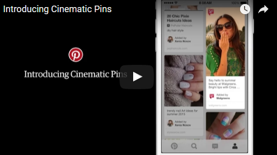
New mobile ad product enables brands to tell stories with looping video ads with the motion controlled by users’ scrolling. Pinterest believes it has found a better way for advertisers to capture consumer attention with motion. Called Cinematic Pins, announced today and coming to Pinterest streams this summer, the new mobile ad product enables brands to create moving Pinterest advertisements. And because the motion is controlled by Pinterest users, the company says, the experience won’t be annoying … like, for instance, autoplay video ads. “What’s really unique about this is that it keeps the user in control,” Tim Kendall, Pinterest’s general manager for monetization told Marketing Land. “We believe that autoplay as it exists today is interruptive and annoying. What we believe we have achieved with Cinematic Pins is a way to delight the user, let them stay in control of motion while also allowing the brand to tell their story.” For Cinematic Pins, users will maintain that control via scrolling on mobile devices. (The ads won’t be served to desktop users, which makes sense since more than 80% of Pinterest activity takes place on mobile). The ads will display on home and category feeds; when a Cinematic Pin comes into view, it will start moving. It will move at the speed the user is scrolling and stop when the user stops. If a user clicks into the Pin, he or she will view a longer, looping version of the video, which plays without sound. Article from: http://marketingland.com/pinterest-will-set-ads-in-motion-with-cinematic-pins-129130
Google recently changed the layout of its search engine results pages (SERPs) by removing ads from the right side and adding extra ads at the top and bottom. In a nutshell, Google has increased the number of paid ads showing at the top of certain types of SERPs from three to four. Also, SERPs now feature three ads at the bottom. In total, the number of paid ads on SERPs has been reduced from 11 to 7 ads. Also, the right sidebar no longer features any text ads. Search engine results pages have fewer ads now and those ads appear in different places. According to most search engine experts, Google’s new update was long overdue especially in regards to right-side ads. Numerous studies have indicated that searchers rarely click on right-side ads. There is also evidence indicating that Google has been continuously gravitating toward becoming a more mobile-friendly search engine. Given the fact that the right-side column of ads wasn’t visible via mobile search, the ads had to go. EFFECTS OF GOOGLE’S NEWEST UPDATE ON SERPS With the recent developments, there has been a lot of speculation on how these new SERP ads update will affect SEO and PPC for instance, how do the new changes impact organic ranking? Should website owners change their SEO tactics or is it business as usual? These are some of the questions that have been lingering in the minds of many website owners. Although there appears to be a rushed general consensus that these changes will impact SEO negatively, this is far from the truth. On the contrary, Google’s newest update on SERPs has made good SEO more important which is a good thing for business owners with great SEO strategies. For instance, there is more focus on organic search results with the right-side ads out of the way. Furthermore, the update only affects SERPs with highly commercial queries. A number of keyword types have remained ad-free or feature just one or two ads on top. These keyword types include; e-commerce keywords featuring PLAs (Product Listing Ads) and no-text ads as well as long-tail keyword phrases. Also, SERPs still feature 10 blue links. The addition of paid ads on the body of search engine results pages hasn’t squeezed off organic ranking positions to other pages. Although organic results have been pushed down slightly on SERPs, the total number of results on all SERPs has remained consistent. Although SERP elements such as answer boxes, related questions, blended image search results etc., can make SERPs include fewer results than the standard ten results, the new update hasn’t lowered the number of organic result count. Navigational branded searches have also remained constant. With that said, it is important to recognize the fact that most website owners looking to improve their organic search traffic may not be amused with the addition of ads before organic links. It is, however, important to note that the average searcher scrolls down SERPs. There is, therefore, no reason to think that the new SERP structure will modify searchers behavior negatively (e.g., searchers won’t scroll down as usual because of the ads). Nevertheless, it is important to react to this update with a solid SEO strategy since the new SERP layout is here to stay. With the right-side ads out of the way, the click-through-rate for first-page organic page results is bound to increase as searchers focus their attention on one column. Website owners must, however, modify their SEO efforts to ensure they grab the attention of keen searchers faster and better than their competitors. An increased focus on click-earning page titles and meta descriptions is certainly something you should be considering to capture more clicks from your valuable first-page real estate. Strategic keyword research is also more important now, more than ever. Website owners must do thorough research on their keywords to identify the SERP layout they will be competing within for different keywords. Website owners need to find and place priority on keywords and keyword phrases that attract fewer ads at the top of SERPs and between organic results. This does not mean you shouldn’t have topical pages it simply means you need to understand what you are competing against for your primary terms. Website owners also need to review top keywords (especially ”highly commercial keywords”) to see the effects of the new SERP layout on their ranking position and craft strategies for improving where necessary. This applies mostly to search results targeting images, videos, and featured snippets. There is also a need for a full review on local search strategies not to mention the importance of placing more emphasis on mobile search going forward. Website owners also need to think about balancing their paid search budgets strategically since PPC ad costs may go up as paid ads get some more attention and the answer isn’t always to spend more when you can’t boost performance organically.
The ‘flatter’, the better As predicted in our 2014 blog, flat design has become a big hit since Apple’s launch of iOS7 in 2013. There is a lot to be said for honest, simple design and nothing says it more than the use of clean, raw shape and colour. I think there is still room for an even flatter approach with more impact and solid shapes to come throughout all things design. Less really is more, which leads nicely into our next trend prediction… Get in shape! Shape is beginning to come to life in the form of icons, logos, backgrounds and repeated patterns in both web and print. From subtle elements such as bullet points and sliced corners to the more impactful die-cut brochures and background patterns, it looks as though things really are shaping up. Custom illustration & interactive animation We are currently submerged in large, crisp, photographic backgrounds and banners. It seems that bigger is better, especially when it comes to web design. Volvo’s website is a prime example of this with a large background image and overlaying menu and text, which as a designer, I think has become a bit of a cop-out. However, the biggest problem with this large, photographic image trend is that it has become so widely adopted making it very hard to be original. No matter what colour and contrast tweaks are made, it is still the main ingredient of the design and no more original than the last. It is because of this that we predict an increase in custom illustrations and interactive animation in the hunt for originality. Typography The infamous designers’ default font, Helvetica, has become something of the past! Typography has become quite a skill, particularly in logo design as we see more and more customised fonts being introduced in order to represent a company’s brand as accurately and uniquely as possible. The majority of logo design today consists of just one piece of typography, which often serves as both the icon and the brand name. From hand-drawn decorative pieces of art to the subtle modifications of an existing font, typography has become a much bigger influence in branding than ever, and we love it. One of the greatest improvements in typography has been with the wide range of web fonts that are now available, largely thanks to Google Fonts. Designers are no longer constrained to the likes of Arial for compatibility with the web, which can only mean one thing… more scope for creativity! Colour The Pantone ‘Colour of the year 2015’ has been announced as Marsala. Pantone have said: “The impactful, full-bodied qualities of Marsala make for an elegant, grounded statement color when used on its own or as a strong accent to many other colors”. This fits perfectly with the trend that is currently unfolding; rich, bold, intoxicating colours. A good example of this can be seen in current interior design trends which illustrates where we might be heading… back to the 80s! Retro is not a thing of the past Retro influences continue to evolve. The only difference is that we may be shifting decades and leaving the more vintage 50s, 60s and 70s to progress to the more colourful 80s and 90s. Notable influences include early computer games, pixilation, vibrant colour and shape and a more common use of intergalactic background images such as stars, galaxies and colourful waves of light. Watch this space!… A graphic design agency needs to think ahead. Here, designer Simon predicts some trends that will develop during 2016.
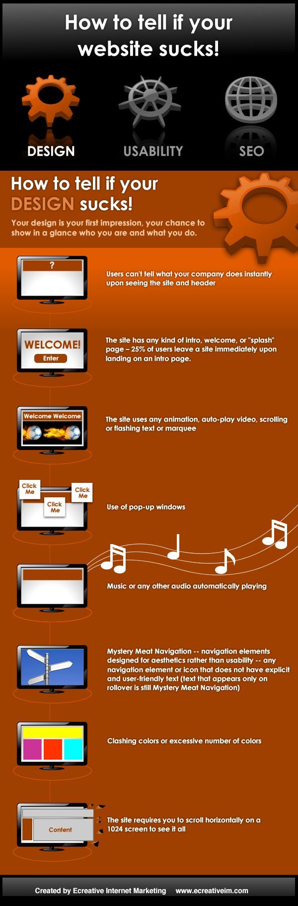
Your design is a person’s first impression of your business. this is your chance to show in a glance who you are and what you do. Users can’t tell what your company does instantly upon seeing the site and header. The site has any kind of intro, welcome, or “splash” screen. 25% of users will leave a site immediately upon landing on an intro page. The site uses any animated gif’s, auto-play video, scrolling or flashing text or marquee. Use of pop-up windows. Music or any other audio automatically playing (unless you are a musician or have an entertainment site). Clashing colors or excessive number of colors. The site requires you to scroll horizontally on a 1024 screen to see it all.