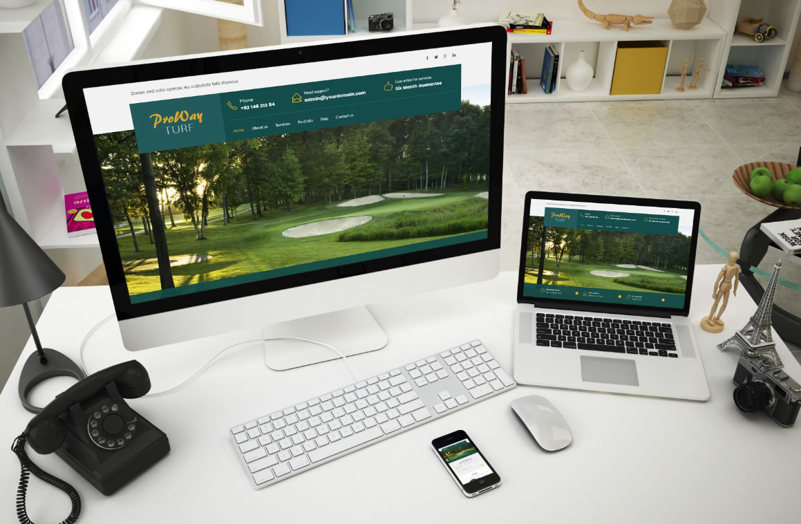
Pro Way Turf has over 20 years experience of turf management for some of the toughest and most prestigious customers in the world, and they can do it for you too! They love to grow beautiful, lush turf because it’s what they do. Powerful and user-friendly, Visual layout builder, Custom post and portfolio – all within a single integrated interface. Booking & Scheduling – awesome appointment booking and scheduling solution if needed. Mobile friendly. Attract customers with extremely easy, fast, and clear booking process. Responsive and google mobile friendly – Your site will look stunning on any resolution device screen. Whenever a person Googles for your niche and comes to your site, it is ready to impress him/her on a 4-inch screen. Built with HTML5 and CSS3 WordPress 3.9 compatible Built on the latest Boostrap 3 600+ Google Fonts included 2000+ Icon Fonts included Visual Composer included – $30 Value Slider Revolution included – 19$ Value Animation Scroll Touchable Carousel Animated Progress Progress Bar & Chart Google Map integration Custom Post Portfolio Custom Widget : <DT Accordion DT Image Gallery DT Post Image DT Tabs DT Twitter Slider Visual Composer custom add-on plugin : DT Icon Box DT Section Heading DT Pricing Table DT Portfolio Image DT Carousel DT Custom Team Item DT Progress Bar Item DT Circle Bar DT Twitter Slider DT Google Map Unlimited Color Options with Backend Color Picker SEO Optimized Unlimited Portfolio Pages Backgrounds with Parallax effect Unlimited custom sidebars Advanced Portfolio Options : Masonry Set up multiple Portfolio Pages Square image full width Fix height full width Filterable categories Pages can have left or right sidebar Advanced Blog Options : Blog with masonry with 3 or 4 columns Post format ready Auto generated thumbnails Pages can have left or right sidebar Tons of options to add or remove meta data, featured images, full or excerpt, etc Built-in 404 Page Full width page Working contact form Interactive Logo, Menu & Search Bar Sticky Navigations Major Browser Compatibility Semantic & Clean Code HTML Extensive Documentation Cross Browser
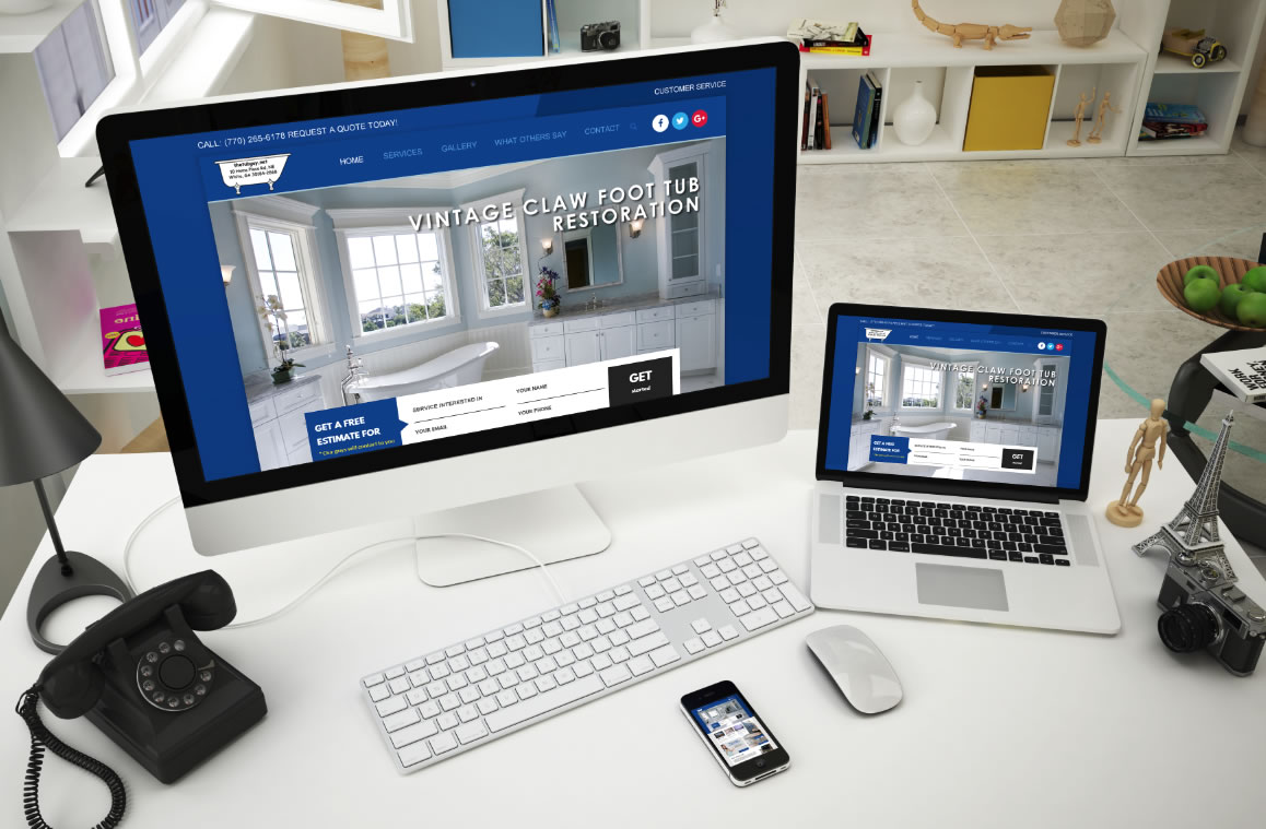
Located in White, Georgia (near Cartersville), The Tub Guy has been serving the North Metro Atlanta area since 1995. They have built a solid reputation for first-class work. This design is well-structured using a combination of boxed and full-width responsive design using dominating strong blue & white colors. Some other functions that would be included in this design: Revolution slider (large image up top could scroll through services) Latest Font awesome icons Multi-widget/sidebar options Drag & Drop builder (to help make editing the website easy for the client) 500+ Google web safe fonts Sticky bar top bar options Custom subheader image for pages and posts Testimonials Widgetized footer & much more!
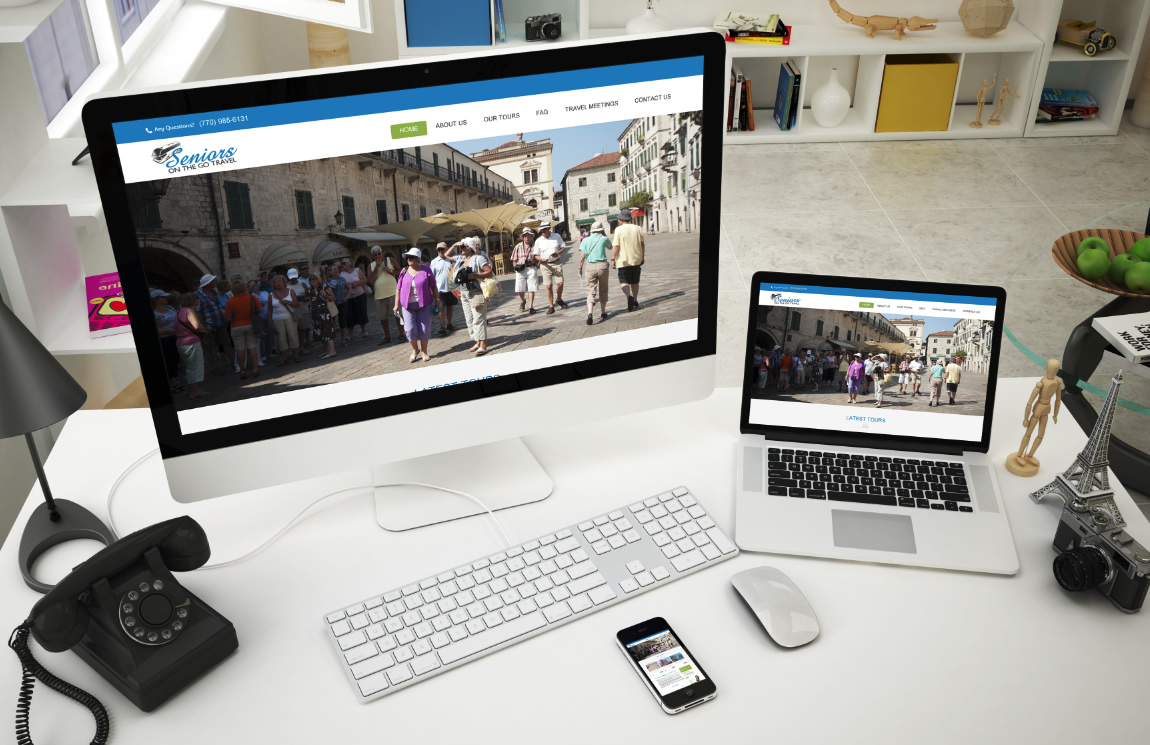
Seniors on The Go Travel Tours is a travel planning company specializing in motorcoach travel for the over 50 traveler who enjoys the fellowship of group travel. We were first hired by the owner back in 2011 and they are now ready to bring their current website into 2016 with a responsive site to make it easier for individuals to view on their phone/tablets. Here are some other features this design would include if needed: User ratings and reviews A full-fledged blog – latest news Woocommerce available if you would like to take payments via your website Tour package filtering Galleries Search Capability 100% responsive design Retina ready Page Builder – to make editing pages or adding pages easy Coded with HTML5 & CSS3 Events Calendar Pro Mega Menu with widget support Google web fonts Layer Slider & Revolution slider (which would be the large image you see on the design….it could scroll through several images) Cross Browser Compatible SEO Ready Responsive Google Maps Contact Form 7 Social Network Integration
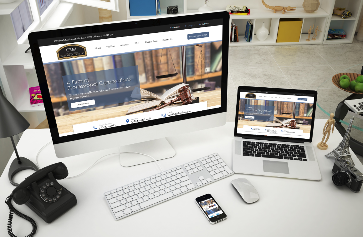
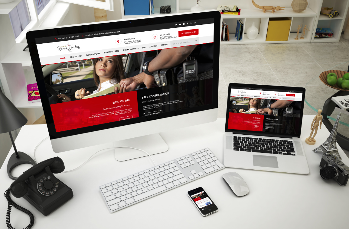
CB& J is committed to providing clients with excellent service and responsive legal representation. Located in Buford, Georgia, the firm is small enough to deliver personalized, cost-efficient advocacy, yet large enough to handle a diverse array of complex cases and practice areas usually associated with a large firm. The firm has been recognized by Martindale-Hubbell in the Bar Register of Preeminent Lawyers signifying the highest level of legal standards and ethics. We designed this with this particular firm in mind and understand each element will create the best product that works for their firm. Here are just some main features of this design: WordPress responsive site for the best performance SEO optimized Retina ready Visual composer – which makes editing the website for your firm as easy as updating a word doc. Slider Revolution – the large image you see up top would scroll through difference images such as practice areas if needed to help grab the site visitors attention. Testimonial setup plugin Well organized & clean code Contact form 7 – for all forms needed Mailchimp integration Unlimited colors Awesome fonts – Google safe Blog/news section /pages and much more
Don’t just have a website. A law firm website is only useful if it brings your firm new clientele. Unfortunately, not all websites are designed to do so. Since up to 40% of all web traffic is now mobile, having a mobile-friendly law firm website is no longer a “nice-to-have.” It is a necessity. Website Would Feature the Following: WSC Validated code output Unique search results for clean and strong results Responsive and retina ready Visual Composer – to help the client make edits to the website an easy task Blog section 20+ Favicon options for all devices SEO friendly Revolution slider Max Mega Menu 600+ Google Fonts for body, logo, menu, submenu, H1, H2, H3, H4, H5, H6 and widget title Google analytics – Easily adding Google analytics via the theme settings Custom CSS and JS code Integrated social links as shortcode Cross Browser Compatibility HTML5 and CSS3 Clean and Fresh style Contact us page by “Contact Form 7” plugin Well Documented & more!!
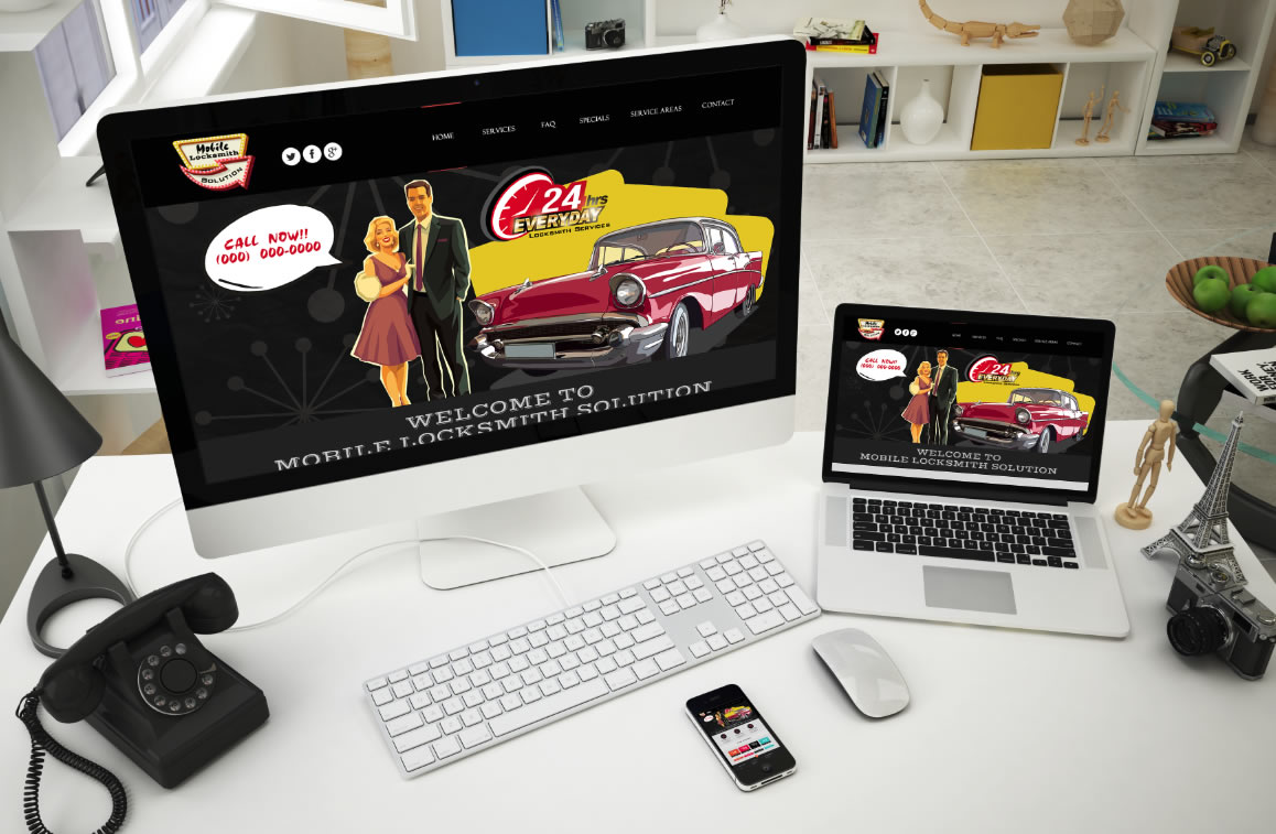
More Than Just Locksmith Web Design Having a professional looking website is something that will represent your locksmith business to potential customers. Customers expect to be able to find out about your business online. It is where they will look first! Introducing a more creative approach to Locksmith website design. A complete retro styled design! We aim to have our clients stand out from their competitors. Let’s face it, there are thousands of Locksmith companies out there on the net so one must set themselves apart to stand out. What this site design would include: Visual composer page builder – to help make editing the website for the client easy Revolution Slider Accordion Slider Flex Slider Owl Carousel Fancybox 2 Instagram Fancybox Twitter Feed Tabs Accordions Pricing Tables Font Awesome Retina Icon Set Icomoon Retina Set CSS3 Icon Effects Contact Forms Blog Testimonial Sliders Google Maps Mobile Nav Responsive Layout – Bootstrap 3
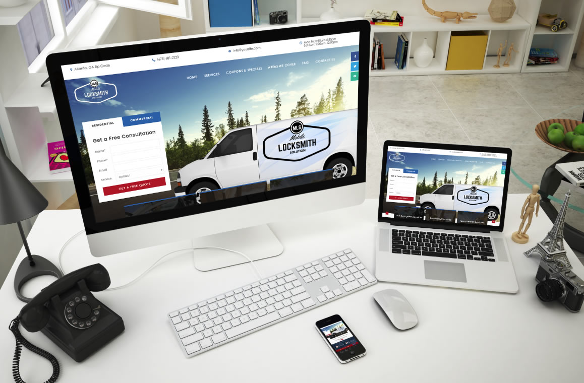
We specialize in modern day locksmith marketing by designing, writing, and search engine optimizing custom “turn key” locksmith websites that are built to rank well in Google, Yahoo and Bing for specific geographically targeted areas. We have helped locksmiths all over the United States increase their sales and grow their businesses by using proven search engine marketing techniques. If you plan to be in the locksmith business for some time to come, it is imperative you have a strong presence online. This design would include a powerful admin panel, plugins such as: Visual Composer to make editing the website for the client easy and less time consuming. Responsive & Retina Ready – mobile friendly site that would work on all types of devices. Slider Revolution – an innovative, responsive slider that beautifies images and content to help draw customer attention Google Fonts Megamenu Contact Form 7 Mailchimp Integration if needed SEO Optimized Social Share Cross Browsers & all platform compatibility Powerful shortcodes ready to use (carousels, tabs, toggles, accordion, tour section, buttons, blockquotes, tables, alert boxes, lists, forms, testimonials, info blocks, progress bar, pricing tables, forms, drop caps, social icons, audio and video players, counters etc.) Sticky menu option Cookie Control popup Twitter feed Instagram feed Valid HTML5 / CSS3 Very cohesive documentation
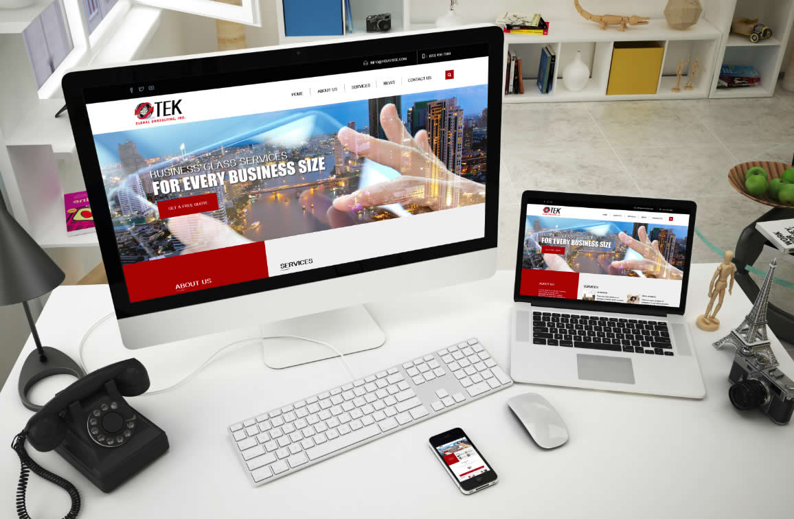
This is a new look of soft and clean professionalism for TEK Global Consulting, Inc. This design combines creativity with simplicity. Will be 100% Responsive Will have Revolution Slider installed Visual Composer – Premium page builder so the client will be able to easily maintain their website. Powered by Bootstrap 3 Google Webfonts Fontawesome Icons A+ Website Speed Woocommerce Compatibility Buddypress Compatibility Advanced CSS Options Optimized & Validated CSS & HTML Code WPML compatibility Mail Chimp ready WordPress Version 4.X Compatible PHP Version 5 Compatible News Section to keep the site alive with amazing design for passing the news Retina Ready Yoast SEO WordPress Shortcodes & much more!!
Google recently changed the layout of its search engine results pages (SERPs) by removing ads from the right side and adding extra ads at the top and bottom. In a nutshell, Google has increased the number of paid ads showing at the top of certain types of SERPs from three to four. Also, SERPs now feature three ads at the bottom. In total, the number of paid ads on SERPs has been reduced from 11 to 7 ads. Also, the right sidebar no longer features any text ads. Search engine results pages have fewer ads now and those ads appear in different places. According to most search engine experts, Google’s new update was long overdue especially in regards to right-side ads. Numerous studies have indicated that searchers rarely click on right-side ads. There is also evidence indicating that Google has been continuously gravitating toward becoming a more mobile-friendly search engine. Given the fact that the right-side column of ads wasn’t visible via mobile search, the ads had to go. EFFECTS OF GOOGLE’S NEWEST UPDATE ON SERPS With the recent developments, there has been a lot of speculation on how these new SERP ads update will affect SEO and PPC for instance, how do the new changes impact organic ranking? Should website owners change their SEO tactics or is it business as usual? These are some of the questions that have been lingering in the minds of many website owners. Although there appears to be a rushed general consensus that these changes will impact SEO negatively, this is far from the truth. On the contrary, Google’s newest update on SERPs has made good SEO more important which is a good thing for business owners with great SEO strategies. For instance, there is more focus on organic search results with the right-side ads out of the way. Furthermore, the update only affects SERPs with highly commercial queries. A number of keyword types have remained ad-free or feature just one or two ads on top. These keyword types include; e-commerce keywords featuring PLAs (Product Listing Ads) and no-text ads as well as long-tail keyword phrases. Also, SERPs still feature 10 blue links. The addition of paid ads on the body of search engine results pages hasn’t squeezed off organic ranking positions to other pages. Although organic results have been pushed down slightly on SERPs, the total number of results on all SERPs has remained consistent. Although SERP elements such as answer boxes, related questions, blended image search results etc., can make SERPs include fewer results than the standard ten results, the new update hasn’t lowered the number of organic result count. Navigational branded searches have also remained constant. With that said, it is important to recognize the fact that most website owners looking to improve their organic search traffic may not be amused with the addition of ads before organic links. It is, however, important to note that the average searcher scrolls down SERPs. There is, therefore, no reason to think that the new SERP structure will modify searchers behavior negatively (e.g., searchers won’t scroll down as usual because of the ads). Nevertheless, it is important to react to this update with a solid SEO strategy since the new SERP layout is here to stay. With the right-side ads out of the way, the click-through-rate for first-page organic page results is bound to increase as searchers focus their attention on one column. Website owners must, however, modify their SEO efforts to ensure they grab the attention of keen searchers faster and better than their competitors. An increased focus on click-earning page titles and meta descriptions is certainly something you should be considering to capture more clicks from your valuable first-page real estate. Strategic keyword research is also more important now, more than ever. Website owners must do thorough research on their keywords to identify the SERP layout they will be competing within for different keywords. Website owners need to find and place priority on keywords and keyword phrases that attract fewer ads at the top of SERPs and between organic results. This does not mean you shouldn’t have topical pages it simply means you need to understand what you are competing against for your primary terms. Website owners also need to review top keywords (especially ”highly commercial keywords”) to see the effects of the new SERP layout on their ranking position and craft strategies for improving where necessary. This applies mostly to search results targeting images, videos, and featured snippets. There is also a need for a full review on local search strategies not to mention the importance of placing more emphasis on mobile search going forward. Website owners also need to think about balancing their paid search budgets strategically since PPC ad costs may go up as paid ads get some more attention and the answer isn’t always to spend more when you can’t boost performance organically.
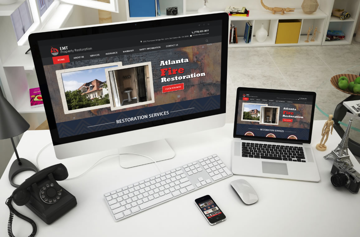
If you do a search for fire/water restoration on the net you will find loads of poorly design sites. I mean just terrible. I could not find one site that looked professional. We do these searches because we research what our client’s competitors are doing. We wanted to make the site inviting, interesting, and overall GRAB the site visitors eye so they will be more inclined to give EMT Restore a call for a quote. What are your thoughts?